Introduction
In this tutorial you will learn to
- understand the original Tk classes
- redefine them into more powerful classes
- master object-oriented programming
Our first program
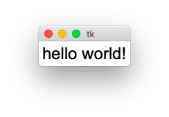
It is somewhat of a tradition for programming tutorials to start with a program which writes hello world to the computer screen. Here is the result of this standard initiation ritual:
So how do we do this ?
First we have to import the module tkinter (Tk interface) and give it the shortcut tk:
import tkinter as tk
Then we create the root widget with class tk.Tk which becomes the root for all other widgets:
root = tk.Tk()
Then we create a label widget with class tk.Label which has root as parent and hello world as text attribute:
label = tk.Label(root, text='hello world!', font='Arial 24')
Then we have to call a placement method such as grid(), to make the label appear inside the window:
label.grid()
Finally we call the main loop method tk.mainloop() which runs continually
until the window close button is clicked or the quit Python menu is chosen:
root.mainloop()
This method call is usully the last one in the program, after all the graphical elements and callback functions have been defined.
import tkinter as tk

root = tk.Tk()
label = tk.Label(master=root, text='hello world!', font='Arial 24')
label.grid()
root.mainloop()
The same in OOP
Now we rewrite this first program in OOP manner.
We start by defining the new App class:
class App:
This class has two methods:
- the constructor method
__init__() - the main loop method
run()
The constructor method creates the instance attributes self.root and self.label.
It then calls the placement method on the label object:
def __init__(self):
    self.root = tk.Tk()
    self.label = tk.Label(self.root, text='hello world!', font='Arial 24')
    self.label.grid()
In case we do not need to keep a reference to the label object, we can shorten the last two lines to:
tk.Label(self.root, text='hello world!', font='Arial 24').grid()
The run method starts the main loop:
def run(self):
    """Run the main loop."""
    self.root.mainloop()
Finally we instantiate the App and run it:
App().run()
This is the result:
import tkinter as tk

class App:
    """Define the application class."""
    def __init__(self):

        self.root = tk.Tk()
        self.label = tk.Label(self.root, text='hello world!', font='Arial 24')
        self.label.grid()

    def run(self):
        """Run the main loop."""
        self.root.mainloop()

App().run()
Classic and themed widgets
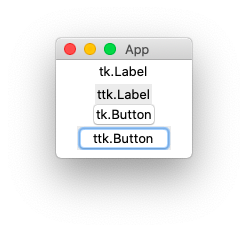
The elements of a graphical user interface are called widgets. In Tk there are two generations of widgets:
- the old classic
tkwidgets, originally introduced in 1991 - the new themed
ttkwidgets, added in 2007 with version 8.5
The new themed widgets can be found in the submodule tkinter.ttk.
Whenever a newer themed widget is available, we will use it.
We import the classic and the new themed widgets with this import statement:
import tkinter as tk
import tkinter.ttk as ttk
This code creates a classic label and a new themed label:
tk.Label(self.root, text='tk.Label').pack()
ttk.Label(self.root, text='ttk.Label').pack()
This code creates a classic button and a new themed button:
tk.Button(self.root, text='tk.Button').pack()
ttk.Button(self.root, text='ttk.Button').pack()
The screen capture below shows the difference in appearance. The new themed widgets (ttk) have a gray background and the buttons have uniform size.
import tkinter as tk
import tkinter.ttk as ttk

class App:
    """Define the application class."""
    def __init__(self):
        self.root = tk.Tk()
        self.root.title('App')

        tk.Label(self.root, text='old classic tk.Label').grid()
        ttk.Label(self.root, text='new themed ttk.Label').grid()

        tk.Button(self.root, text='tk.Button').grid()
        ttk.Button(self.root, text='ttk.Button').grid()

    def run(self):
        """Run the main loop."""
        self.root.mainloop()

App().run()
Setting options
Options can be set in three ways:
- at object creation, using keyword arguments
- after object creation, using a dictionary index
- use the config() method with keyword attributes
# setting options
import tkinter as tk
import tkinter.ttk as ttk

root = tk.Tk()
ttk.Button(root, text='Set options at creation').grid()

button = ttk.Button(root)
button['text'] = 'Set options as dict'
button.grid()

button = ttk.Button(root)
button.config(text='Set options with config() method')
button.grid()

options = button.config()
for x in options:
    print(x, options[x])

print(button.keys())

root.mainloop()
Let’s define our own widget class
We are now going to redefine the original tk and ttk classes to make our own Tk widget classes. This new classes have the following advantages:
- the text option has a default value (Label, Button, etc.)
- the parent object is automatically set (root)
- all keyword arguments are passed on (kwargs)
- the themed version is used when available (ttk)
This is our new Label class based on the original themed class:
class Label(ttk.Label):
    """Create a Label object."""
    def __init__(self, text='Label', **kwargs):
        super().__init__(App.stack[-1], text=text, **kwargs)
        self.grid()
This is the new Button class:
class Button(ttk.Button):
    """Create a Button object."""
    def __init__(self, text='Button', **kwargs):
        super().__init__(App.stack[-1], text=text, **kwargs)
        self.grid()
Button
Buttons can be clicked and are used to execute a command associated with them. The following demo creates 4 buttons.
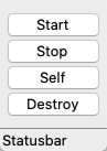
- The Start button prints Start to the console
- The Stop button prints Stop to the console
- The Self button prints the button object string to the console
- The Destroy button removes the button from the window
from tklib import *
app = App('Buttons')

Button('Start', 'print("Start")')
Button('Stop', 'print("Stop")')
Button('Self', 'print(self)')
Button('Destroy', 'self.destroy()')

app.run()
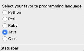
Radiobutton
Radiobuttons are active elements which can be clicked and execute actions. Only one button is active at any one time.
from tklib import *
app = App('Radio buttons')

Label('Select your favorite programming language')
Radiobutton('Python;Perl;Ruby;Java;C++', 'print(self.item)')

app.run()
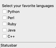
Checkbutton
Checkbuttons are active elements which can be clicked and execute actions. Multiple checkbuttons can be selected simultaneously.
from tklib import *
app = App('Checkbuttons')

Label('Select your favorite languages')
Checkbutton('Python;Perl;Ruby;Java;C++', 'print(self.selection)')

app.run()
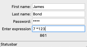
Entry field
Entry entry field presents the user with a single line text field where he can enter a string value.
from tklib import *
app = App('Entry fields')

Entry('First name:', 'print(self.var.get())')
Entry('Last name:', 'print(self.var.get())')
Entry('Password:', 'print(self.var.get())', show='*')

Entry('Enter expression', 'App.res["text"] = eval(self.var.get())')
App.res = Label('Result')
app.run()
The tklib module
In the following section we are going to redefine the tk and ttk objects.
To make it easier to use them, we follow these design principles:
- we keep the excact same class names
- the parent object is chosen automatically
- all keyword arguments are forwarded
The first widget to consider is the Label which just places static text.
Where it makes sense, a label will be combined with a button or entry widget.
There are three types of buttons:
- Button
- Checkbutton
- Radiobutton
There are four types of entry widgets for text or numbers, which allow to input text with the keyboard or making a choice uint the mouse:
- Entry
- Combobox
- Spinbox
- Scale
Then there are the two complex display widgets for text and graphics:
- Text
- Canvas
These two widgets present lists:
- Listbox
- Treeview
Finally these widgets are helper widgets:
- Frame
- Separator
- Window
- Scrollbar
- SizeGrip
- Progressbar
- Menu
- ContextMenu
- Panedwindow